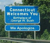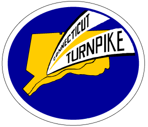
So I came across this lovely image of an original Connecticut Turnpike sign, which longtime Nutmeggers will remember from years gone by:
 Which was in use here during the late 1950's until the 1980's, when the last of the highway tolls were removed and the turnpike became a freeway called I-95 and I-395.
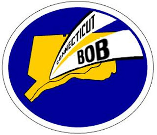
I took the image and did some crude photoshopping (actually, it was crude "LViewing", my crappy 16-bit image editor that is much simpler to learn and use) and viola! The trick, she is done!
UPDATE: Commenter John Blossom improved upon my original stolen design, and I edited it slightly more, to get this:
 I think the "BOB" needs to be rotated slightly to align it vertically, but I haven't figured out how to do that in PS7. Anyone? Anyone? Bueller?
Who knows? Perhaps I'll set up a "Connecticut Bob" store, and T-shirts, baseball caps, and refrigerator magnets will be available in time for Christmas!
Eh, probably not.
But I still like the new logo.
11 comments:
I like it. It would go nicely in the bottom right corner of your videos as an ovelay, kind of like the NBC peacock or what-have-you.
I like.
Although I miss seeing your face at the top of the blog.
Spazeboy, yeah it would look cool there (while simultaneously annoying the viewer!) If I can figure out how to crop it around the oval, I can overlay it onto my videos.
Sarah, thanks, although I can't imagine that there's even ONE other reader of this blog who ISN'T sick of seeing my goofy mug plastered all over it. I figure my hits will double once word gets out! LOL!
Bob,
Here's a quick hack at a Photoshop version of the new logo:
http://www.shore.com/files/ctbob.gif
http://www.shore.com/files/ctbob.psd
Second one requires photoshop.
Hope that this helps
here's the same with your face included:
http://www.shore.com/files/ctbob2.gif
http://www.shore.com/files/ctbob2.psd
Thanks John. I like the first one better, so I captured it and opened it with Photoshop. I do have PS 7.0, but I still never learned how to USE it properly! One of these days I'll get around to it.
The BOB needed to be centered a little bit, which I did, but the font looks real good. I'll post the updated one soon. Thanks again!
John, quick question: I want to fill the area outside the outermost oval with a different color. I know how to sample a palette color, but how do you "pour" color into a defined area?
Or barring that, is it possible to crop the image, so the outer edge of the larger oval is the border? So the image will be an oval rather than a rectangle with the corner areas filled with white?
Sorry, I can't hep with photoshop, but I think it looks pretty cool.
although your blog was already on my map the logo rocks. My oldest is a "Bob" so if you decide to Cafe Press it I will be happy to plunk down some hard earned to buy it.
I have a friend who does silk-screening...I'll have to get a quote on shirts from him.
Bob,
Use the PS "magic wand" feature to select the area - play with the pixel sensitivity if you need to - and then fill it with the paint bucket.
I didn't invest a lot of time in this, but I am glad that it helped. Try the "skew" features in the "edit" menu, that might help with the letter alignment, I used some of that but didn't have enough time to get it perfect.
Post a Comment